New address construction is into real estate development and construction business in Bangalore. They have developed many residential as well as commercial estates in and around Bangalore.
The task
Being into real estate they had many properties where their logo was on display. However, their existing logo could not make the impact and failed at being the face of the company. Logos are critical part of business marketing and are the chief visual part of a company’s brand identity. Hence the task for us was to design a logo that was simple, memorable, timeless and versatile.
The Thought
We set out to design a unique logo that would speak to their target audience. Further a logo appears on stationery, websites, business cards and the properties they develop. The biggest hurdle for us was to develop a logo that was simple and strong. Also it has to look good both on a business card and a billboard.
The Process
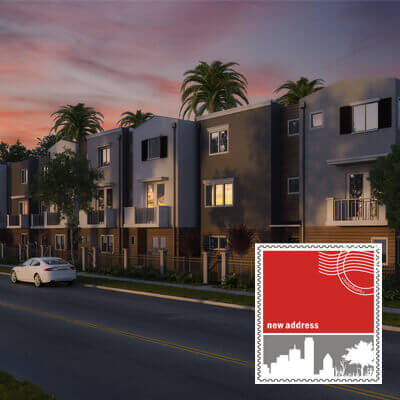
Firstly, we set out to create several mock ups of the design. The design has to show core features of the company without compromising on likability. The second step was to choose a colour that was bold and eye catching but at the same time not gaudy. That is why we chose red and grey which was vivacious and classy. Thirdly, we added a tagline to communicate the brand. And lastly we brought it all together to create the perfect logo for our client.
The result
The result of the hours spent on the hard work was client satisfaction. We got a new client who was eager to work on more projects with us. While the client got a logo that was a visual delight and left lasting impact on the viewers.